Note: The links in this post are affiliate links.
If you take a look at most any photographer’s portfolio, what you’re likely to see is a collection of his/her very best shots.
After all, no one really enjoys showcasing images that aren’t so great.
That’s right, even the most talented and experienced photographers take plenty of duds which typically are left out of their galleries.
That being said, some of the awesome shots that end up being shared with the world didn’t start out all that great.
Some were too dark, others were a bit blurry, and still others had unwanted objects in the scene that detracted from the overall appearance of the photo.
Thanks to the power of digital photography and modern image editing software, many of those not-so-great captures can be salvaged and even turned into works of art.
Most pro photographers use the awesome Adobe PhotoShop, but if you don’t wish to lay out hundreds of dollars for the full-blown Photoshop package, Photoshop Elements offers plenty of power and functionality for us casual photographers.
I’ve been using Photoshop Elements since it was at version 4.0 (way back in the stone age of digital photography).
If you’d rather not shell out a few bucks for a commercial image editor, there are several free alternatives such as GIMP and Pixlr that do many of the things I’m getting ready to discuss. But I personally prefer Photoshop Elements because everything is so intuitive and easy to use.
And now, on to the tips…
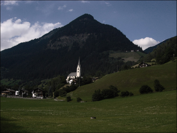
Note: We’ll be using this photo of an Austrian church to illustrate the tips that follow:

1 – Bring the photo’s primary subject in close by “Cropping” the image. In this case, the primary subject is the church.
We will also use the “Rule of Thirds” which will remove the church from the center of the photo and place it closer to a corner.
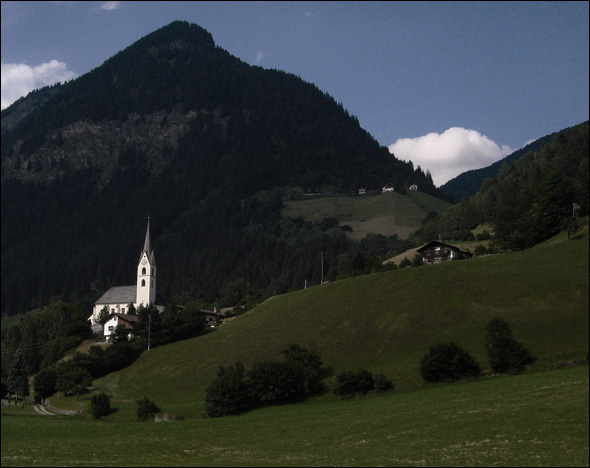
After a bit of cropping, we end up with this:

2 – Next, we’ll brighten the scene up a bit by adjusting the “Brightness” control.
The objective is to reduce the overall “shadow” effect and highlight the church by making it a gleaming white color.
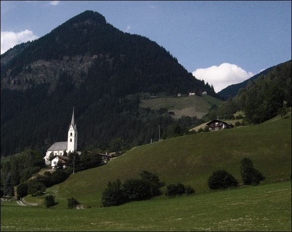
This is what we end up with:

3 – Next, we’ll increase the “Color Saturation” to bring out the beautiful green in the grass and blue in the sky:

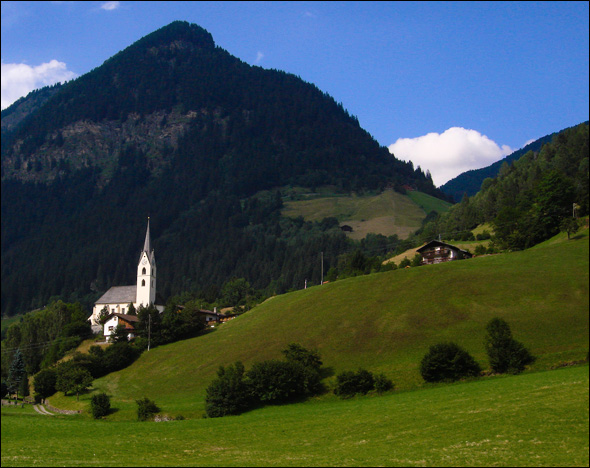
4 – And finally, we’ll use the “Clone” tool to remove the distracting structures that appear just to the left of the white cloud on the right.
After cloning out the structures, this is what we have as a final image:

As you can see, just a few quick adjustments can enhance most any photograph and make it better.
Again, the key is learning how to use the awesome tools provided by a quality image editing program such as Photoshop Elements or one of the great free image editing tools that are so popular these days.
Good luck, and have fun!
Note: Image courtesy of Eduardo Arraes.